October 14, 2025
.png)
Every week, we’re running a new ad simulation in Quvy, changing just one creative feature at a time to see how it impacts overall predicted ad performance.
Quvy’s AI ad testing platform processes millions of perceptual, behavioral, and emotional data points for each simulation, so we can see what actually drives engagement, before launching a single ad.
For our first test, we focused on one of the strongest patterns we’ve seen in our internal model analysis: color dominance, or how diverse and balanced an ad’s color palette is.
The Setup
To test how color diversity influences performance, we used the same Quvy ad, “See Beyond Pixels. Predict Emotions.” — and created five variations.
.png)
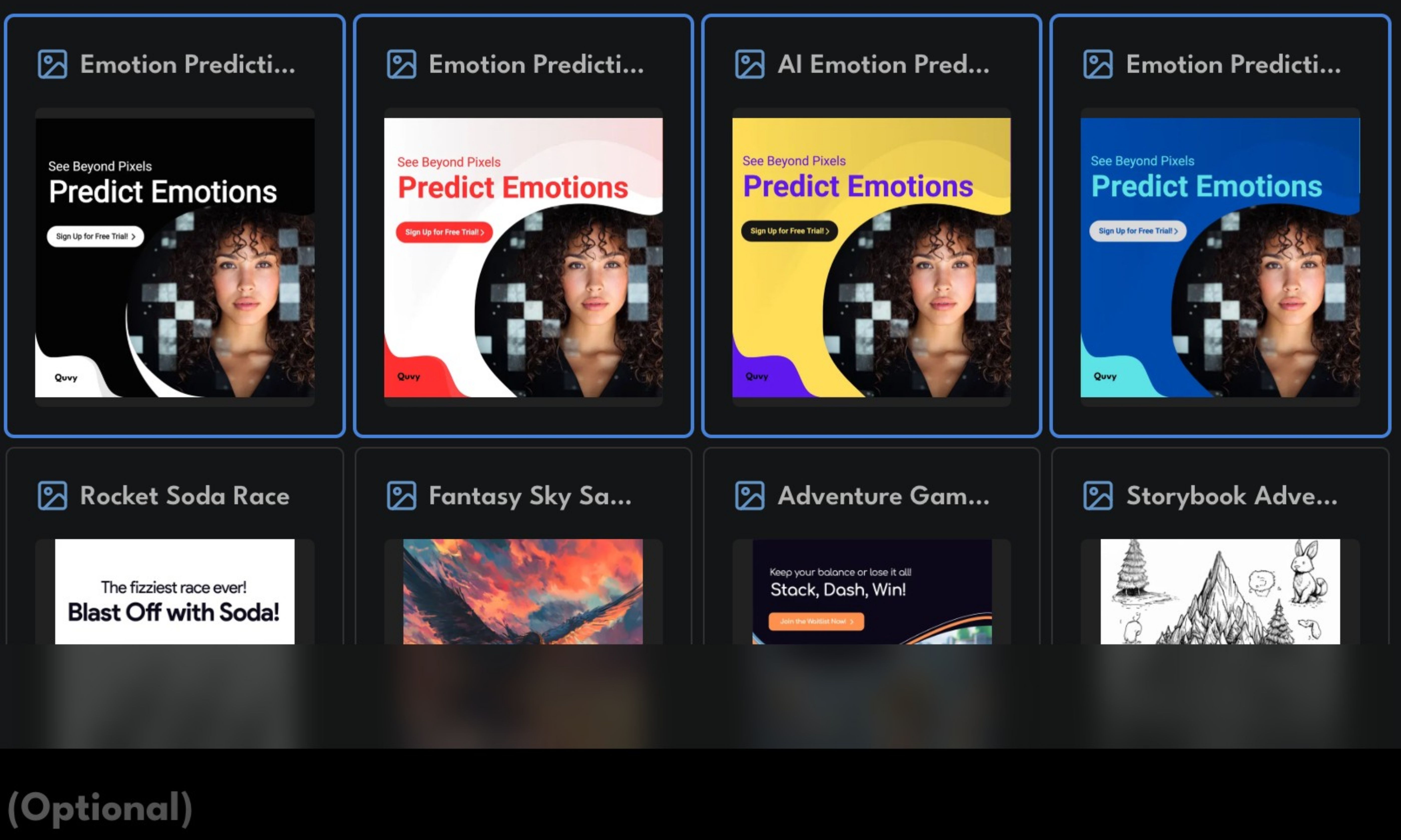
Each version kept the text, layout, and composition identical. The only thing that changed was the color palette.
Here’s what we tested:
- Monochrome (Black & White) – Minimalist and single-tone
- Analogous (Blue + Teal) – Smooth, cohesive cool-toned palette
- Complementary (Red + White) – Bold warm-to-neutral contrast
- Triadic (Yellow + Purple + Black) – High color diversity with strong variation
- Neutral + Accent – Simple base with one subtle brand highlight
Each version was then run through Quvy’s Ad Simulator to predict percentile rankings and creative strength using synthetic audience feedback.
The Results: What Happened When We Changed the Color
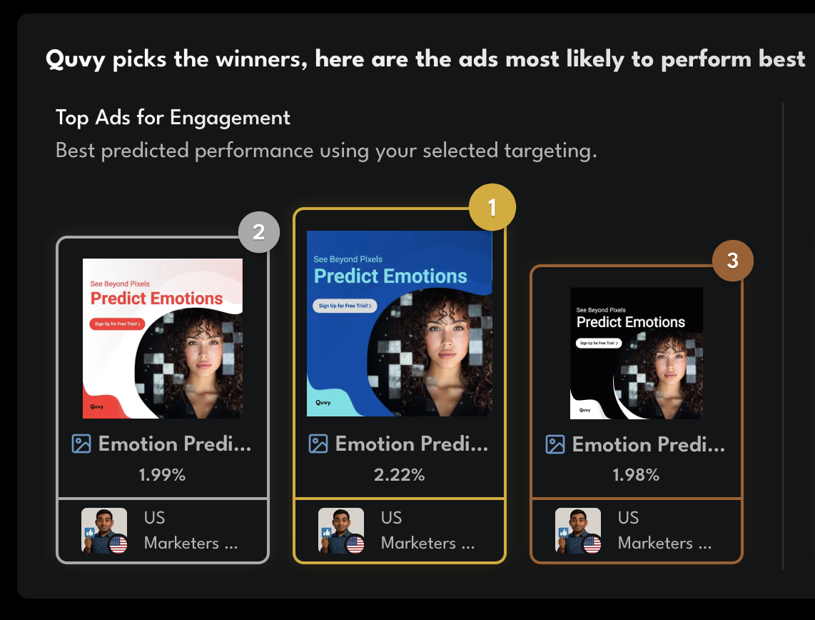
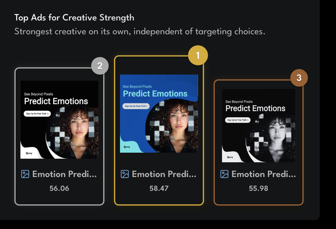
According to Quvy’s simulation results, the blue–teal ad came out on top, earning the highest engagement percentile (85th) and creative strength score (58.47).
The red–white version followed closely with an engagement percentile in the low 80s%, while the black-and-white ad wasn’t far behind at around the 78th percentile, proving that simple, clear designs can still perform well.
Overall, the results back up what we’ve seen in our model analysis: ads with balanced color and visual harmony tend to engage viewers more than flat or overly intense palettes.
Quvy’s AI also picked up another pattern, ads with even brightness and cohesive color mixes consistently scored higher, showing that thoughtful design choices can make a real difference before you spend a single dollar on traffic.
Why It Matters
Our engagement and creative strength analysis has repeatedly shown that color and brightness balance play measurable roles in how audiences perceive and interact with creatives.
High-performing ads aren’t necessarily the brightest or most colorful, they’re the ones that feel visually balanced, emotionally coherent, and easy to process.
The Blue–Teal ad’s success illustrates this perfectly: it combined cool tones that conveyed trust and clarity while maintaining subtle contrast to hold attention.
In short, it’s not about choosing a “trendy” color, it’s about creating color harmony that enhances message clarity and emotion.
This week’s results reinforce that the best-performing ads often balance calm and energy, bold enough to stand out, but not so saturated that they overwhelm the viewer.
Key Takeaways
- Color variety outperforms single-tone visuals in engagement percentile.
- Balanced brightness and cohesive palettes drive the highest performance.
- Monochrome ads excel in clarity but slightly trail richer palettes in overall percentile ranking.
- Quvy’s ad simulations uncover subtle visual cues that shape ad success long before launch.
What’s Next in the Quvy Ad Simulation Series
Next week, we’ll test text length, comparing short, snappy copy with longer, more detailed versions to see which format the model predicts will win.
Want to run your own ad simulation?
Start free at Quvy.com and test your creative in minutes.