.png)
Welcome back to the Quvy Ad Simulation Series, where we isolate one creative element each week and test how it affects predicted ad performance using Quvy’s AI ad testing platform.
Last week, we explored color diversity and learned how multi-tone palettes can boost engagement.
This week, we tested how the amount of text inside an ad image impacts results. Does more information help, or just clutter your design?
The Setup: Same Visual, Different Text Density
We created five versions of the same ad creative, keeping the layout, subject, and CTA placement identical.
The only difference was how much text appeared in the ad image itself.
In this simulation, the only difference between the versions was the amount of text displayed in the ad image itself. The Minimal Text version featured just one or two bold, clean words such as “Test Smarter.”
The Short Text version included a slightly longer phrase of three to five words, like “Predict Ad Performance Fast.”
The Medium Text version expanded to six to ten words, delivering a full statement such as “Know Which Ad Works Before You Spend.”
The Long Text (Informational) version contained a complete sentence of ten to eighteen words, for example, “Stop wasting budget. Simulate your ad’s performance instantly with Quvy.”
Finally, the Text-Heavy (Cluttered) version used a multi-line paragraph overlay, such as “Most ads fail. Quvy simulates your creative performance before launch so you can test smarter, save budget, and improve results.”


The Results: What Quvy Predicted
When tested in Quvy, shorter ad text consistently delivered higher percentile rankings across creative rating and engagement potential, while longer and denser versions scored lower.
Top Ads for Engagement
- Short Text — “Test Smarter.”
- Minimal Text — “Predict Ad Performance Fast.”
- Text-Heavy Version
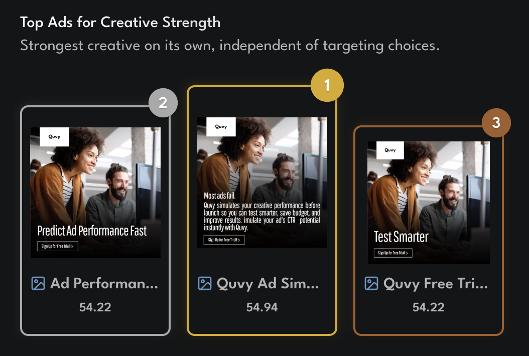
Top Ads for Creative Strength
- Text-Heavy Version → 54.94 rating
- Short Text → 54.22 rating
- Minimal Text → 54.22 rating
So while the Text-Heavy version scored the highest in creative strength (meaning it stood out visually and emotionally), the Short Text ad ultimately led in predicted eengagement percentile, the clearest indicator of how well it’s expected to perform against similar ads.
In other words: strong visuals can grab attention, but concise text converts it.
Interpreting the Data
Quvy’s interpretability layer highlighted three key features that influenced these outcomes:
- Word Count → fewer words correlated with higher engagement percentile
- Digits & punctuation → simpler text improved readability
- Positive sentiment → led to stronger emotional response
Even though the Text-Heavy ad looked compelling and complex, its denser layout diluted focus, while the simpler versions made the message easier to process instantly, a critical factor in fast-scroll environments.
Key Takeaways
- 3–5 words in ad visuals performed best overall.
- Keep layouts clean — let visuals lead and text support.
- Creative strength ≠ engagement — sometimes less text wins more attention.
- Short, positive phrasing communicates faster and boosts clarity.
Want to test your own ads before launch?
Start free at Quvy.com and see which version wins before you spend a cent.